Back in December 2012 I moved to a new team – from what was DevOps to .NET (same 3 roles as before – Dev Manager, Project Manager, Head of Project Management).
As part of my ramp-up on the team, products, customers, market and current challenges I was briefed by my new Product Manager and Division Head on the areas they’d like me to focus for the next few months – and asked to deliver some draft plans for each of these.
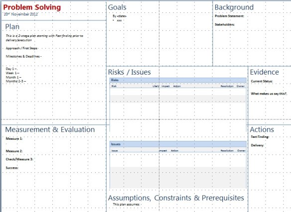
I scratched around online to find a suitable A3 problem solving template as a thinking tool and struggled find anything that was quite suitable. The majority of A3 problem-solving tools are around defects/quality and root-cause analysis.
There’s a lot of wisdom in performing an RCA for a problem but sometimes you just need to move forward (see my “stopping the line” article). In my particular case the change of teams would not be confirmed until I could satisfy my new potential boss that I was capable of covering their needs. In order to prevent confusion and disruption, this meant “going it alone” on my first iteration of a plan without interviewing the team on their thoughts. That makes performing an RCA problematic.
Here’s the A3 template I used.

Click here for a link to the PPT version
This got me far enough to complete the review – a win!
After discussion, I moved onto deciding next steps. Moving form vision and strategy to plans and actions and found that whilst I had a set of options, my timing was bad. The following week was “Down Tools Week” for all our development teams. Nobody was freely available to hassle about current projects and products and I didn’t want to interrupt the amazing things everyone was doing.
Rather than waste a week, I moved onto priority number 2 – increasing the team’s customer understanding. This needed less input but was also less well-formed in terms of approach, options and actions. My original plan had suggested one possible option but during review, it was felt I needed to provide and evaluate some alternatives.
I had the information to achieve this but hit a wall.
After half a day of thrashing with a blank slate I approached my new Division Head and asked for his help. I explained I was blocked. I had the right information but couldn’t move things forward. We spent 10 minutes discussing the problem with him essentially working in “Rubber Duck” mode.
After talking through the blockage we established a way forward. We discussed the (now much longer) list of options and an initial set of evaluation criteria for these. And I agreed to turn this into “some kind of evaluation matrix”.
As soon as I returned to my desk things fell into place…
We regularly borrow a few visual management techniques from Lean (we had a former Toyota UK guru spend a day a week here for a couple of years consulting with us on a wide variety of management topics).
One particular technique that has proven exceptionally effective is the visual representation of “Good/OK/Bad” using a colored circle, triangle and cross. When we were first introduced to this notation we were sceptical. Now, 3 years later we have a common visual form that all managers understand with patterns that can be seen at a glance and the approach is part of our routine reporting across all areas of the business. Even the monthly roll-up report for all projects I track across the entire development portfolio uses this same notation.
I took the list of options we’d been discussing and both positive & negative evaluation criteria, applied them to a matrix and used the (then new) notation to capture my thoughts.
Here’s the outcome.
 Without any reading at all, the 3 strongest options stood out. Better still, this technique didn’t need anything more than expertise and instinct. I’m free to follow up with further research and evidence if needed but at that point we were after a first-cut and a quick narrowing of options to focus our efforts.
There’s an important subtlety in this notation to be aware of. A yellow triangle means “OK”. It’s not a problem but we think we can do better. A green circle means “Good” – we mean really good – not just “fine”. This ties back to an article I wrote back in 2011.
When we report something as “good” on a project status, we expect supporting evidence. When something is “ok”, we ask “how can we help or improve this”.
What this evaluation is saying is that we have a couple of really strong options that would help us achieve our goal. They’re strong rather than just the best of what we have.
Next time you’re trying to figure out what to do, try these 2 visual management and thinking tools as a way of unpicking and reassembling your options into something simpler and more cohesive. If you’re lacking options that have enough “good” points, try some more alternatives, don’t just big the best of a bad bunch.
(In the end I spent a year working with the .NET team. and shared a sample of the results here. )
